
Five interactive UI components that bring your pages to life, flip cards, hover menus, scroll animations, social buttons, and expanding team cards. Drop them in, style them up, done.
The Interactive UI Elements Pack gives you five ready-to-use components built around hover effects, scroll triggers, and micro-interactions, the kind of details that make a site feel polished and alive. Perfect for frontend developers, freelancers, and designers who want to ship engaging interfaces without reinventing the wheel every time. Each component is standalone, lightweight, and easy to drop into any project.
What you get:
- 5 x source code files (HTML + CSS + JS)
- Clean, well-commented code
- No frameworks or libraries required
- Works on all modern browsers
Normally €25 - get all 5 for €15.
Five ready-to-drop carousel and gallery components that bring motion, polish, and visual storytelling to any web project. Smooth parallax effects, nested sliders, testimonial carousels, and a responsive photo gallery, all in clean, framework-free code. Grab it, drop it in, ship it.
What you get:
- 5 x source code files (HTML + CSS + JS)
- Clean, well-commented code
- No frameworks or libraries required
- Works on all modern browsers
Normally €48 - get all 5 for €38.
Everything you need to build a modern, interactive landing page. No frameworks, no dependencies, just clean and ready-to-use code.
This bundle includes 5 hand-crafted components:
Normally $25 - get all 5 for $15.
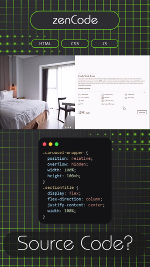
A hotel room showcase component built around a clever two-level navigation idea. The outer carousel lets visitors browse between different room types, double room, family room, luxury suite, while inside each slide, a second carousel cycles through multiple photos of that specific room. All in one smooth, contained layout.
Next to the photos, each slide presents the room name, a short description, a clean grid of amenity icons and a price per night, plus a "Book now" button ready to link wherever you need it. Everything is laid out to feel like a mini room page, not just a gallery.
The whole thing works with arrow navigation on desktop and is fully responsive for mobile. A great fit for any hotel, guesthouse, or vacation rental site that wants to present its rooms in a way that actually makes people want to book.
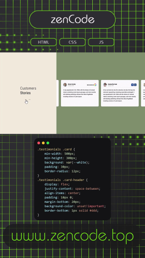
A clean, two-panel testimonials section that lets your customers do the talking. On the left, a calm gold-tinted panel holds the section title and a pair of navigation arrows. On the right, review cards slide in smoothly one by one, each showing a real face, a name, a date, and the rating from the platform it came from, whether that's Google, Booking, or Airbnb.
The carousel moves on its own, pauses when someone hovers over it, and responds naturally to swipe gestures on mobile. Navigation arrows give users full control whenever they want it. The layout adapts gracefully from wide desktop screens all the way down to small phones, stacking into a single column without losing any of its polish.
A ready-to-drop-in component for any hospitality, travel, or service-based website that wants to show off its reputation without making a big deal out of it.
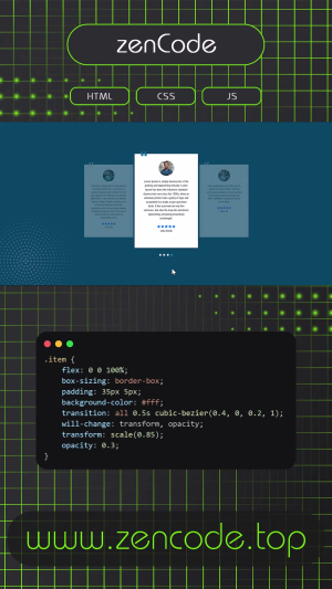
This project is a responsive and modern testimonials carousel built with HTML, CSS, and JavaScript. It features a smooth infinite-loop slider that automatically cycles through testimonial cards, while also supporting manual navigation through dots and touch swipe gestures for mobile devices.
Each slide includes a customer photo, quote icon, star rating, and testimonial text, styled with a clean centered layout. The active card is highlighted with a scale-up effect and stronger opacity, while surrounding cards appear smaller and faded to create a depth-focused carousel look.
The slider adapts across breakpoints, showing 1 item on mobile, 2 on tablets, and 3 on desktop. It also includes pause-on-hover functionality and smart transition handling to prevent visual glitches during infinite looping.
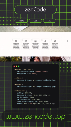
This project adds life to your content as you scroll—literally. Using scroll detection and staggered animations, each card smoothly slides in when it enters the viewport, and gracefully exits as it leaves. The result? A dynamic, animated flow that reacts to user behavior in real-time.
Each "objective" card includes a background image, icon, text, and a big bold number, all styled with clean, modern design. The layout is fully responsive and built with HTML, CSS, and vanilla JavaScript—no libraries needed. It also features background sections with blurred overlays that help frame the content while maintaining a light, glassy aesthetic.
It’s great for timelines, feature highlights, onboarding flows, or anything where you want to guide your users’ attention section by section.
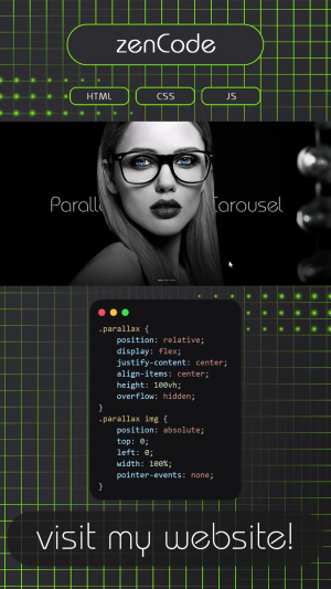
This project is a full-screen carousel with a stylish parallax twist. As the user scrolls, each layer of the slide—text and images—moves at a slightly different speed, creating a smooth depth effect that brings the visuals to life. It’s a simple concept, but the result feels dynamic and immersive.
The carousel rotates automatically, but also supports manual navigation. Each slide features large hero imagery, custom fonts, layered animations, and floating text that glides horizontally based on the scroll position. There’s also a subtle fade-in on entry for added elegance.
This project combines structured functionality with artistic motion. It’s a great fit for creative portfolios, landing pages, or any site looking to create a strong first impression.
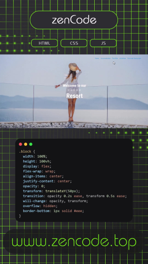
This project gives your content a smooth, elegant entrance as users scroll down the page. Each section fades in and gently lifts into place, creating a flowing, cinematic feel that keeps users engaged as they explore.
Designed with HTML, CSS, and a touch of JavaScript, the layout includes a fixed side menu, a full-screen hero section, and alternating image/text blocks that highlight different parts of a luxury resort (or anything else you want to feature). The scroll-based animation adjusts each block’s opacity and position dynamically, creating a soft “cascade” effect that feels natural and responsive.
It’s perfect for landing pages, product presentations, or storytelling layouts where visual rhythm and subtle movement can make a big difference—without overwhelming the experience.
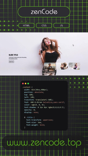
This project is a sleek, modern image carousel built for flexibility and flair. Each slide features a full-screen background image with an overlay of content that subtly fades in—making it great for portfolios, landing pages, or product showcases.
Users can manually scroll through slides using stylish Bootstrap Icons, or just sit back and let the automatic slide transition do its thing every few seconds. On top of that, the layout is fully responsive, adapting seamlessly to all screen sizes—from wide desktop views to compact mobile screens.
Whether you're presenting visuals or telling a story, this carousel keeps your content moving—literally and visually.